To improve the GUR-SIG mentoring scheme, one of my goals is to produce examples of the work that user researchers do. Students on the scheme have asked about wanting to see a games user research report, however because real reports are often under NDA, mentors can find sharing real reports a challenge. To help address that, I produced an example usability review during some downtime last year, which I’ve shared in this post.
This post also adds some context to the report, to help explain why this is the format chosen for this games usability report – hopefully this will be some help to students looking to understand more about what is expected from a games user researcher.
Producing a usability report
This is a usability review of the first two chapters of the Telltale Batman game. When I was at PlayStation, performing a review like this was one step of the recruitment process, and something we’d expect all researchers to be able to do.
Because it’s based on usability best practises and heuristics, it’s a usability review, not a report of a user test (only the expert reviewer played the game, no ‘real’ players did).
The format of our reports is usually a PDF export of a powerpoint presentation. There are a few reasons for this:
- The report is written to be presented – by presenting it to the developer in person, the researcher can give context around the issues and help make sure the audience understand the issues, and commit to fixing them.
- The report can also stand alone as a complete document in itself, so can be taken away and shared with a wider audience after the debrief.
- As a PDF it’s harder for others to edit the report – there were instances where developers selectively copied and shared sections of their usability report, omitting the bad news. Although it’s impossible to stop that entirely, you can take steps to discourage that sort of behaviour.
- Lastly, Mirweis, one of our team’s leads, had made a nice powerpoint template which integrated well with our other software, automating a lot of the report generation process.
So, we used powerpoint! Onto the details…
Title Page
The title page – nothing exciting here, it’s just the core information about the research – the game, the date, the reviewer, the method.
Objectives and Method
Framing the research can help prevent misunderstandings or answer some common questions that developers will have. The report starts with a section that explains what we wanted to learn from the research, how the research was run and introduces the prioritisation key used through the rest of the report.
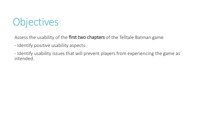
For this specific review, the objectives are very general – identify usability issues. For a real test, the researcher will have met with the developers before running a review to understand what specific research questions they had – however with no access to the dev team, the objectives in this example report are broad.
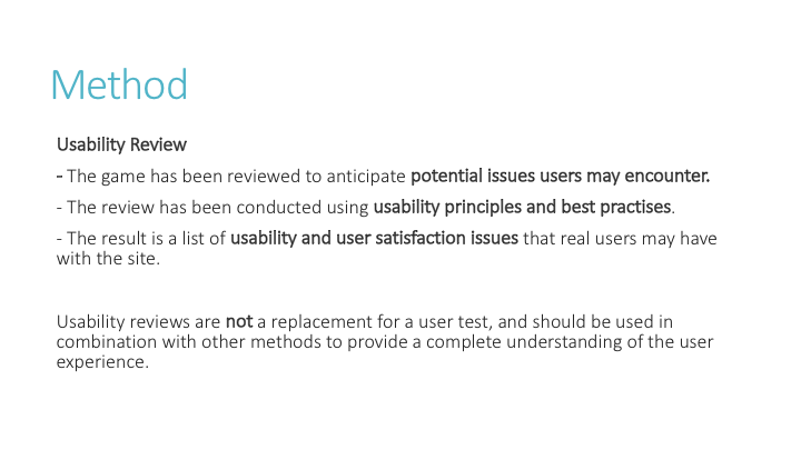
Game Developers won’t be as familiar with research methods as the researcher is, and so some explanation of your method is useful to explain how you ran the review. If the researcher relied on more formal methodologies like heuristics, these should be introduced here too.
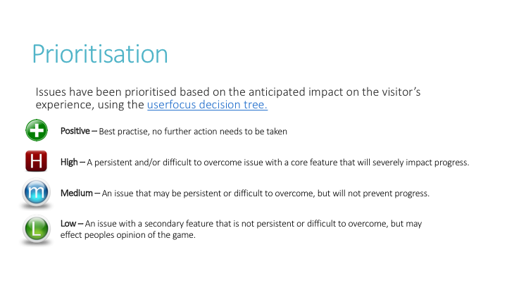
Prioritisation of issues is important in order to help developers decide which issues need their imminent attention, and which can go on the backlog. We used an adapted version of user focus’ prioritisation key, and the severity of each issue is made clear through the use of icons throughout the report. You should also have nicer icons than these – I was relying on clipart!
Positives
Starting with things that worked well has two advantages. Not only does it help developers identify which features were well implemented and worked as expected (so they know what not to change), but it also makes them feel good – important when you’re about to give critical feedback!
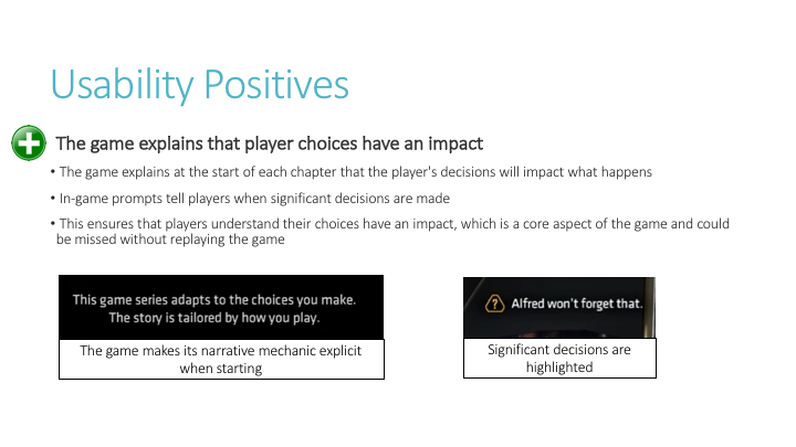
For each usability best practise your review identified, include relevant screenshots, a description of why it worked, and details of the impact on the player’s experience of the feature working as intended.
Only one positive is in this section currently. There are other positives in the report, but they are related to some of the issues we discuss, so I’ve moved them into the relevant groups, as we’ll see.
Usability Issues
Onto the usability issues…
The usability issues are grouped by theme. This makes it both easier to present (because you are talking about a lot of similar items together), and easier for the developer to deal with. Often different members of the team will be responsible for different aspects of a game, and so splitting your findings into topics helps them give the findings to the right people.
The groups are prioritised, so those with the most severe issues appear first.
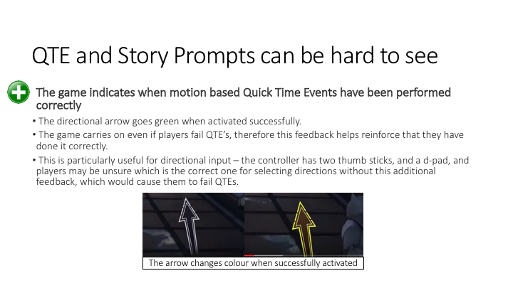
So, this is another positive – a usability best practise, as indicated by the icon.
It could easily have been put in the ‘usability positives’ section, however I decided that because it was relevant to this group of issues about QTE prompts, it made more sense to present it within this group.
As with the other usability positive, it includes details of what is good about it, and the impact that this has on the player’s experience.
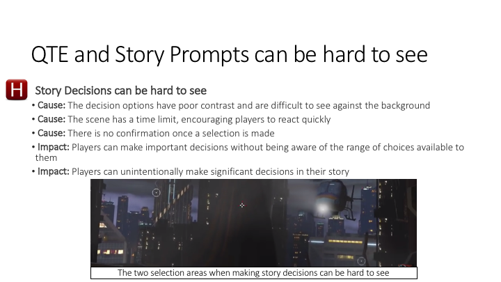
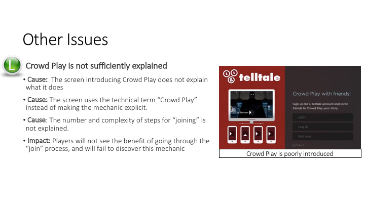
Onto the actual usability issues. Some things to notice about this page:
- The issue has been prioritised, as indicated by the icon, and the most severe issues appear first
- A screenshot has been provided to help explain the issue (although its hard to see in this small version of the report)
- The causes – the reasons the issue occurs – has been included and specifically called out
- The impact – how does this issue affect players – has also been specifically called out
- There is no recommendation for how to resolve the issue. I’ll explain a bit more about that in the next steps section.
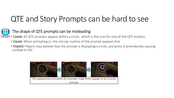
Another issue within this same group about QTE prompts.
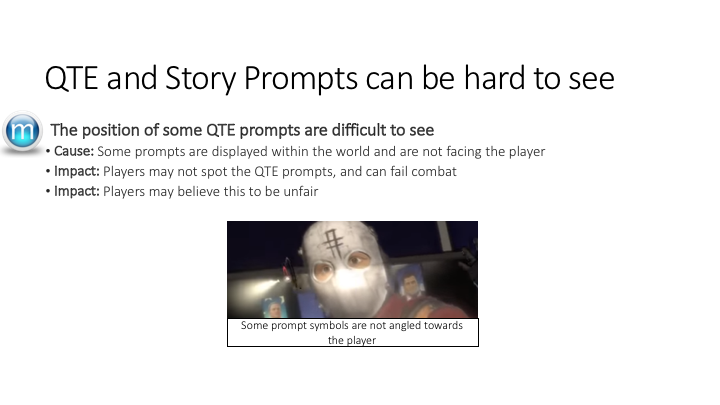
And a final issue within this same group about QTE prompts. These were both medium priority issues, as indicated by the icon on the slide.
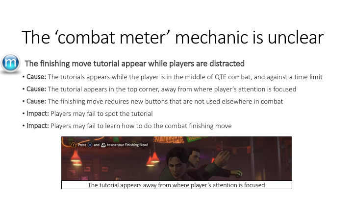
Time for a new group of issues, this time all about the combat meter – so the title for this group summarises the issues within it.

As evident in this slide, an issue can have multiple causes. When it does, they should be ordered by ‘most impactful’, but all should be listed.

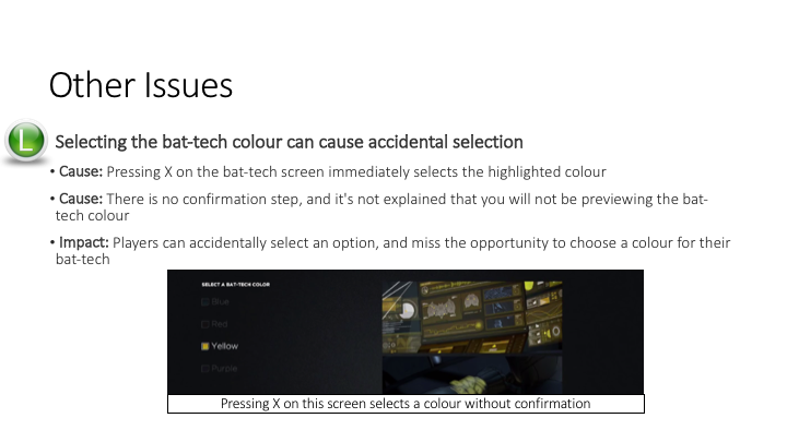
I only had two logical groups for the issues in this report, then a few left over issues that didn’t fit together into a group. Rather than create extra groups with only a single issue in, I’ve made a last generic ‘other issues’ section, to include all of the low priority issues that don’t fit into the existing groups.
After listing all of the usability issues, the report then covers what we’re going to do next – to fix these issues.
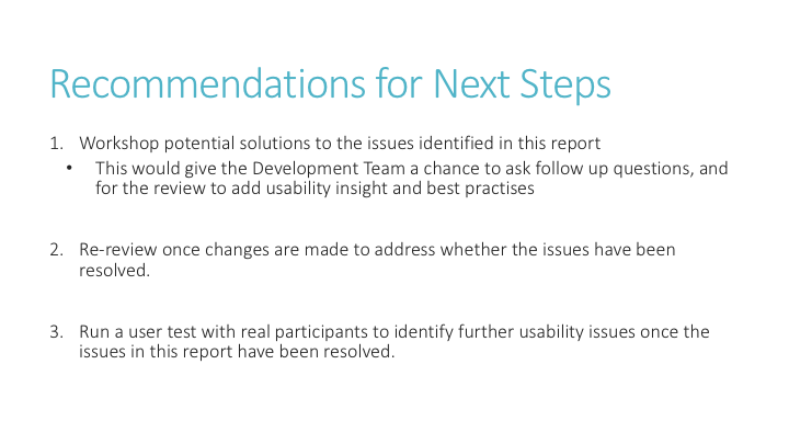
Three things on this slide.
The first is the workshop. In a typical debrief, we’d pair sharing the usability issues with a session about fixing the issues. This is in place of providing recommendations ourselves – often with something as complicated as games, many ‘obvious’ solutions would not be possible. So, to reduce the time taken suggesting things that cannot be done, instead we prefer development teams to generate solutions themselves. A workshop format means that the researcher can input their usability best practise and knowledge, while still making sure that developers lead the discussion on what fixes are appropriate.
The second point is about re-reviewing the findings after changes have been made. User research is an iterative process, and a single round of research isn’t that helpful – without re-reviewing the game, the developers won’t know if they’ve addressed the usability issues. So, as a next step, setting the next round of research up is a good step.
The last point addresses the limitations of an expert review – no matter how experienced the expert is, it won’t replace the quality of findings found in a real user test. So, a researcher should always be pushing to run a ‘real’ test.
And finish with some contact details, so if the report gets forwarded beyond the original audience, the researcher can be contacted.
So, that was a usability report for a game. Happy to answer any questions, or hear insight from other researchers about how they share their user research findings with teams.
Great example! It looks fairly similar to a standard heuristic evaluation without the fancy usability principle names. I’m willing to do this for free if it gets me a job somewhere!