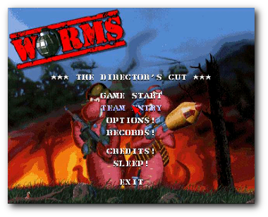
I’ve recently been getting back into both Worms and Worms 2 on the iPhone, largely due to the Bluetooth enabled multiplayer mode. Worms, for those who don’t remember was a hugely popular turn-based shooter in the nineties, and the 1995 original was the first game I bought on the PC!

Classic Worms
However the iOS port has made a huge usability sin with its misuse of icons. Today I’ll look at what the problem is, and how it could be resolved.
Icons
Icons are visual pictures that act as a navigation or access point to software features. They are typically small pictures that represent an intuitive representation of the feature that they represent, for example a picture of a printer for the print function.
A good icon will be visually distinct and recognisable, yet have a close match to the function being represented. It will also be uncluttered and make its function explicit.
(Interestingly, floppy disks are still used as the icon for saving, despite the fact that many computer users now will no longer be familiar with the original thing! As such, the icon no longer matches the function, and has become an abstract icon)
So, what’s wrong in Worms?
Icons are used in Worms when creating the map for multiplayer games. Here are the icons that are presented to the player upon starting a new game:
Worms Icons...
Let’s address each of these in turn.
Flying Saucer Thing – This controls the level’s theme, and matches what is displayed currently. However clicking it will take the level to the next theme (i.e. not the one pictured in the icon), which is counter-intuitive. This icon therefore doesn’t clearly indicate what it does without having to test it, which forces the player through some very slow loading times!
Question Mark – This changes the landmass, and is currently displaying as ‘random’. This is only obvious after clicking on it a few times however, each click signifying a different state of the landmass. Again, this leads to large loading times.
Arrows – This ‘refreshes’ the map, and gives a new random layout. This icon follows the standard for refresh, which is good, however makes no attempt to explain this functionality.
Mine – This controls the number of mines that are placed on the screen, and cycles between showing 0-3 mines. Like many of the other buttons, although the icon clearly refers to mines, it misleads the player by showing the current status, rather than what will happen when the button is clicked.
Coffee Cup – No idea what this does. If you click it, it cycles through showing 0-3 coffee cups, but I’m none the wiser what this refers too.
How can this be fixed?
It’s obvious in most of these cases that the icons are also functioning as status indications for the current map, which serves to confuse what the functionality behind clicking the button is!
As featured on UX Myths, Michael Zuschlag says that “icons contrary to intuition, do not necessarily help the user find a menu item better than a text label alone. It’s not worth it.”
With these items in Worms, he’s definitely right. If these icons were replaced with text to indicate their function (such as ‘change theme’, ‘randomise level’), this would lessen the confusion caused by them functioning as status indicators otherwise.
I’d even suggest, if space wasn’t available for both, to just pick text – it’s less ambiguous, and can give a much more direct understanding of the functionality. Besides, a lot of the things being indicated in the icons (such as the level theme) is clearly visible in the level itself!
Leave a Reply