Just a short update this week, sharing some thoughts on the recent Nielsen-Norman report on usability for the iPad. The recently published study was based research from a combination of both expert evaluation and user-testing, and aimed to discover how people interact with the iPad, and what issues typical users would encounter that prevent them from achieving their goals.

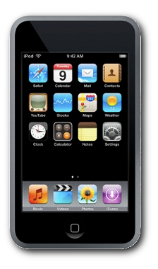
An iPad Nano
Jakob Nielsen admits that the study is not as thorough as a typical usability study. However has decided to share it anyway, due to the over-inflated impact that usability studies produced early in a devices’ lifecycle have been seen to have. As an aside, this is an interesting contrary viewpoint to the disadvantages of being first-to-market noted in ‘Inmates’, which argues that being first to market is irrelevant compared to being ‘best’.
The report has some interesting key findings, including that the apps seen on the iPad and the iPhone suffer from the re-emergence of a problem not seen since the early 90’s. Unlike web browsers and desktop software, which has established graphical conventions to highlight buttons and GUI elements, iPhone and iPad software has not implemented standard conventions, such as making a clickable button appear 3D. Hence there is no consistent manner of designating important aspects of the UI, and users just didn’t know what they could click on. Nielsen likens this to the first emergence of graphical interfaces of the early 90s, when anything and everything could be a button.
Its therefore clear that the main recommendation of the study is to standardize common elements, like navigation, among first and third party applications, such as “swipe to turn page”, or “press and hold to delete”. This also links with the studies’ findings that users were unsure what reaction their action would cause, as the apps have yet to find a consistent manner in which to work.

Not just a big iPhone
The study highlights how the iPad is not just a big iPhone, and different usability issues emerged on the larger device – most pertinent is that navigation elements on the bottom of the page, as seen in many iPhone applications, will not work on the iPad. The larger screen means that these elements are too far from the user’s field of vision to be noticed – and hence are not appropriate. What this means for people who make apps is that a custom iPad version is needed, not just relying on the ‘universal’ up scaling of iPhone apps.
The full report is linked below, and worth a look if you’re interested in the usability, the iPad, or designing an application!
Read the full report, here.
There’s a good retort to Nielsen’s findings here: http://bit.ly/cCOMKZ
Very interesting reading!