Following up from my recent review of the top positive user experience elements in Driver: San Francisco, this week I’ll be looking at the top 5 usability and user experience issues that cause a negative player experience.
For each issue, I’ll also discuss potential fixes that could be implemented in order to create a more positive game playing experience.

Image by wiiloveit (Flickr)
1. Boost Implementation
Early in the game, the player is given the ability to ‘boost’, gaining a temporary speed advantage, by pushing the left analogue stick up. However, because this shares a control with steering, a number of usability issues occur.
I encountered a large degree of accidental activation, particularly in missions which required precision driving, since I was using the stick to steer also. This accidental activation caused the car to lurch forward, and made completion of the precision driving difficult.
Although it may be a design decision, I also encountered issues with steering while boosting – because the player is required to push the stick forwards, this reduces their ability to steer to the left or right to the same extent.
Instead, the boost control should be mapped to a specific button, which it doesn’t share with any other controls, and hence accidental activation would be minimised.
2. Unclear definition of Mission Goals
Throughout Driver: SF, I found that the game was good at telling the player what their goal was, but not the steps to achieve this. For example, a very early mission finds the player driving an ambulance, and tells the player to “keep the patient’s heart rate above 20”. The phrasing of this objective implies that the player can take action to raise or sustain the heart rate, however no indication is given to the player towards the game mechanics that can achieve this.
I encountered a similar issue when first running from the cops. The game told me to ‘escape the cops’, yet gave no indication of the techniques or skills needed to achieve this. It was not until I failed the mission where the game explained that the player should “weave through traffic to escape the cops”.
Through improvement of the hint system (detailed further below), and increased communication to the player prior to mission start (for example, on the mission acceptance screen), there is the ability to communicate the techniques required, and guide the player to the successful completion of their mission goal.
3. Hints
In Driver: San Francisco, the player can press a button to see a hint related to their current mission at any time. However my experience of the hint system was that the hints were often unhelpful, and either repeated, or paraphrased the objective. For example, an early mission said “go to the garage”, and the hint was “drive into the garage”.

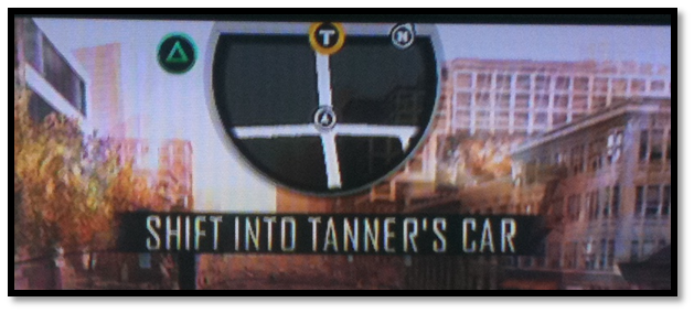
Objective...

...and its hint.
A player would only be pressing ‘hint’ when they were unsure of how to complete their current objective, and would therefore find no benefit in being told the objective again. Instead, through thorough user testing, and evaluation of the nature of the problems that user’s encounter, it would be possible to anticipate the real problems players have, and provide context relevant hints.
4. The MiniMap

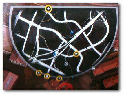
The expanded mini-map
Driver SF’s MiniMap suffers from a few usability issues. Primarily, even in the expanded view, there is no key to reference what the icons represent. In the screenshot above, it’s evident that there are different mission types (a flag, a star, a padlock, lightning?), however the player has no ability to discern what each of these icons refer to.
Secondly, no indication is given on this map view of the relative differences in distance between each mission. Should the player be using this screen to decide what mission to complete next, they are not given the full information required to make an informed judgement. This could easily be resolved by using transparency to indicate each map item’s relative distance to the player.
Finally, one of the icons on the screen is a padlock. If the player travels to this area, they will find that they cannot do anything once they arrive there. The mission is locked. As the player cannot interact with this area, there is no reason to indicate it as a place of interest on the map, since this will only potentially cause the player to travel there unnecessarily.
5. Investigation Screen

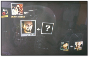
The investigation screen
Finally, I was confused by the investigation screen. This page was accessible from the main menu, and (likely) intended to sum up the plot so far. Pictured above is the investigation screen after two hours of game play.
This screen offers no interactivity, and is exactly as pictured above. The pictures aren’t selectable, and there is no additional information. This page therefore fails to communicate the story, or serve as a reminder for what the player has learned so far. To improve it, each item should be selectable, and offer increased context on what each picture represents, based on what the player has learned through the game’s story so far.
Conclusion
I really enjoyed Driver: SF, however as noted above, it did have a number of usability and user experience issues, which can cause the player experience to suffer. Through increased use of user research to understand and anticipate potential issues, these issues could have been avoided. Jason Avent, formerly of Black Rock Studios has said that user research can add 10% to a metacritic score, which would have pushed Driver SF into the coveted ‘85%+’ bracket.
A point to make about number 1 is that it could be a portage issue – that is, it might have only arisen when the game was ported from one console to another. I don’t know what platforms the game is out for, but it’s possible that the native release has far better ergonomics.
Still, that’s no excuse for the other issues. 5 in particular just looks like a plain old badly thought-out feature. All could have been resolved by a small number of usability tests. Many could have been resolved by a foundation in usability theory.
Steve, in your experience, how open are most developers to the idea of dedicated usability research? Is it something many try to do, albeit with mixed results, or is it a completely alien concept to them? I’ve tried to push usability improvements in a couple of independent mods I’ve contributed to, only to be met with blank stares. Is this true of the industry generally?