Long time readers may remember that I was excited about the prospect of Game Center, Apples new social gaming hub. Much like Xbox Live, PSHome, or indeed iPhone competitors such as Openfeint, it offers achievements, and the ability to play with friends, compare achievements and start multiplayer games. Due to iTunes’ erratic behaviour, I’ve only just been able to upgrade to OS4.1 and get it, and my initial impressions are less than enthusiastic. Game Center seems to make basic usability mistakes that you wouldn’t expect from Apple, and it’s … odd. Almost like it was designed by the work experience guy. Here are some of the major issues I found.
Adding Games
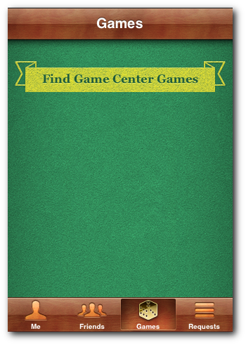
Having been late to the party with game center, many of the games I owned had already been updated with game center functionality. However you wouldn’t know this from game center itself. I opened up the game center app, to find this:

Where are my games?
Oh, I don’t have any game center games. But that’s not right, as I know I do. I guess you have to press “Find game center games”. So I did. And I ended up on the app store. But I don’t want to buy any new games, I just want to use game center with my existing games.
Instead, to add your games to game center, you have to go through and open each game individually before game center will become aware of it. I have a lot of games. This will take some time. Surely Apple should have automated this, making the app automatically scan your phone for relevant games (or even giving an option if they didn’t want it to be automatic!)
Friends
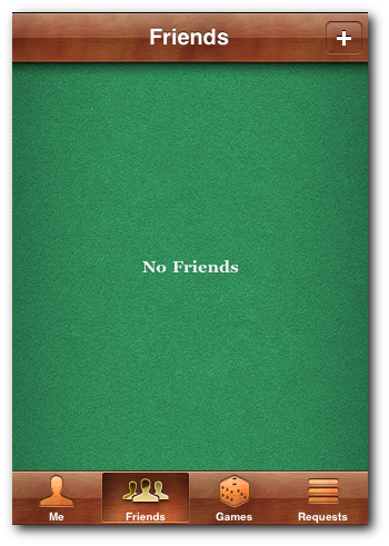
Having successfully added a game, I wanted to find someone to play it with. I went to the friends tab, and was greeted with this:

Just like school all over again
Oh dear, that’s not very friendly. And the call to action (the + symbol up top right) is given very low priority. Surely that should be the first/only thing displayed on this screen if I have no friends. Currently, they’re just being mean.
(That said, anyone want to be my game center friends? I have none!)
Buttons
You may have noticed, in that first screenshot, what buttons look like in game center.

A button?
Since when has the word art ‘banner’ template ever been an appropriate icon for a button? Buttons generally are styled to encourage clicks, hence techniques such as using embossing to give a ‘3d’ effect, giving a depth that implies something push-able.
Instead they’ve decided to use a banner. Surely a banner implies that they are presenting information, like the page’s title, rather than requiring an action to be taken. Hence the ‘Find Game Center Games’ button looks more like information being displayed, and will prevent some users from taking the necessary action to find game center games (although, as described earlier, this button is not particularly helpful anyway!)
Sign-Up
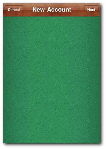
And last of all, my favourite step of the signup process:

Signing up...
Game Center – great idea, but the execution still needs some work!
Game Center has really come a long way. There are two very big things that I want to see changed though. First, is the design. It has to go. It is the most un Apple like thing I have ever saw. The next thing is messaging. Why can we still not message each other on Game Center? This would make gaming with our friends 10 times easier. I just want to be able to remind them to take their turn already. :]