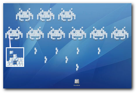
Just under 40 years ago, the desktop metaphor was devised as a way to allow computer users to understand graphical interactions with their computer. Standard tasks, like using a calculator, or deleting files, were presented in a manner familiar to workers from a traditional office place, as an effort to build their experience of computing upon pre-existing knowledge. And, as is evident by this metaphor’s continued existence today, it was a massive success.
Just under 16 years ago Microsoft attempted to reinvent the desktop metaphor, and bring it up to date. The product, Microsoft Bob, aimed to shift computing from an office metaphor to a home metaphor. And it was a massive failure. My first home computer came with Bob installed, and so today I’ll be looking at why it failed, and what we can learn from this failure.
Usability advantages of the desktop metaphor.
So why has the desktop metaphor proved to be a lasting success? Introduced at a time when graphical methods of interacting with a computer were new, it had several key characteristics that led to its success.

...such as fun games
First of all, the desktop was familiar. Rather than having to learn context specific methods of interacting with a computer, it built upon the user’s pre-existing knowledge. For example, when deleting a file, a user could use their existing understanding of a trash can, and drag the file into it (rather than running a deltree command, which doesn’t map with any real-world knowledge). Therefore the desktop metaphor was easy to figure out, and consistent with real life experience, reducing the learning curve upon adoption. This meets Nielsen’s heuristic on a ‘match between the system and the real world’.
Building upon this familiarity was the appropriateness of the desktop metaphor for the tasks at hand. Before home computing, the workplace was the most likely place for users to use a computer, and the computer would be performing office-based tasks, such as word processing or calculating. Hence the adoption of a workplace metaphor seemed appropriate for developing a graphical user interface, as it registered with the target market. This meets Nielsen’s heuristic on ‘recognition rather than recall’.
Furthermore, the desktop metaphor was wide enough to expand to meet the growing roles that computers played. By extending the workplace metaphor through terms such as ‘cut’ and ‘paste’, and the development of graphical tools emulating image manipulation tasks, the desktop metaphor proved that it wasn’t static, and could extend to reach an ever growing range of requirements.
The desktop metaphor also met the heuristic requirement, of having a wide degree of flexibility, by allowing ‘experienced’ users to automate or speed up tasks, such as by selecting groups of objects, or utilizing keyboard shortcuts.
What did Bob try to do?
In the mid 90’s, Microsoft Bob was devised as the successor to the desktop metaphor. Recognising a growth in home computing, Microsoft aimed to shift the graphical interface model for computing from a business/creative focus, to the ‘home’. It was thought that this would open the computing world to a whole range of ‘novice’ users, who would have found the desktop metaphor inaccessible.
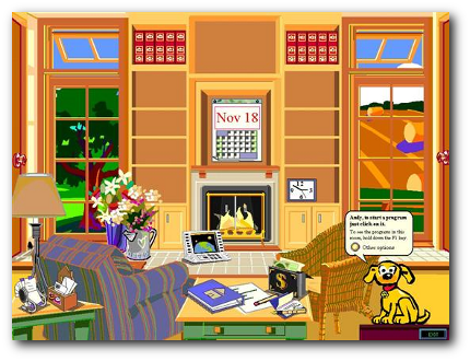
Bob presented the user with ‘their room’, covered with clickable objects, such as bookcases, clocks and a notepad. Clicking these things will launch the relevant program (or help you locate files), and you can add your own programs to the shelves. It’s just like your home! (assuming your home is littered with boxes that say ‘Internet Explorer’ and ‘Corel Draw’).

Bob in action
Why did Bob fail?
Microsoft Bob offered an alternative to using the desktop metaphor, aimed at novice users, but its primary failure was that it didn’t offer any significant advantages. For a product that came over twenty years after the ethos of its competitor, this wasn’t a good sign…
Despite being based on the home, Bob still had a learning curve, and so missed it’s key objective of being intuitive. Clicking on a clock to open a calendar, or a pen and paper, still required just as much learning as a calendar or notepad icon in a traditional desktop environment. More complex tasks than just opening programs still require further learning. Also, the enforced ‘home’ layout is just plain inefficient – rifling through a cabinet to find a file offers no advantage to browsing a list of files in a folder.
By attempting to change the way people interacted with computers, Bob alienated itself from existing computer users, and prevented new users from being able to ask for help from power-users. By offering only ‘simple’ ways of interacting with computers, the user was unable to allow users to grow, and learn superior (and more efficient) ways of performing tasks.
It’s also apparent that the ‘cuteness’ of Bob didn’t sit well with users. The two elements of this operating system which outlived the OS itself are among the most hated villains of computing – Virtual assistants like Clippy, and the Comic Sans font. Obviously Microsoft failed to understand the needs of their target market.
The final nail in Bob’s coffin came within a year of its release. Microsoft released Windows 95. It sold… quite well, and offered a fully-powered alternative to Bob based on the traditional desktop metaphor. Bill Gates punished those responsible for the mess that was Bob. He married lead project manager Melinda French. Burn.
What will replace the desktop?
It’s obvious through Bob’s failure that the Desktop cannot be beaten by a simple re-skin or appropriation of another metaphor without offering significant advantages.
As I wrote about in my review of The Humane Interface, Raskin proposes a ‘Zoomworld’ which offers a non-windows environment with no gaps between the operating system and the files. However development by Archy has stalled and they seem to have fallen off the internet…
Or maybe the future will be more like Google, and involve typing queries or commands into a prompt to find answers and perform tasks? Although this does seem like a regression, and breaks several key usability best practises.
So what other systems are out there that offer a viable alternative? Or will it be desktops forever? As ever, I’d be interested in hearing your thoughts in the comments below!
As Michael from RaskinForMac has brought to my attention, a Version of ZoomWorld has been developed for the Mac –
http://raskinformac.com/